A community art center — woven together, by design.

Six woven strips,
one circle.
A community interlacing into something whole — connection, care, and creative making, held in a single hand-stamped mark.
Rooted in community — contemporary & confident.
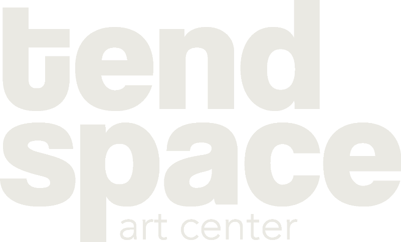
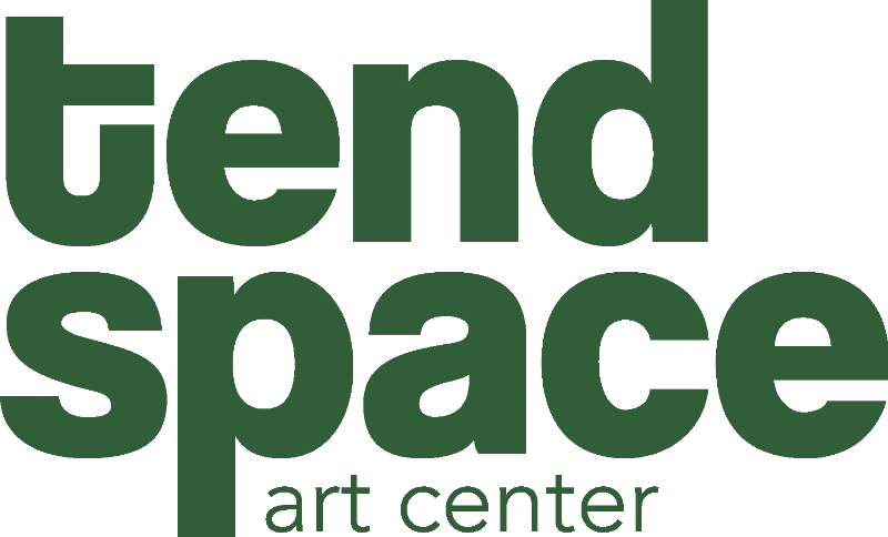
Tend Space needed a brand that felt rooted in community while still looking modern. I built a bold, minimal identity around a woven circular mark — a symbol of connection and creative interlacing — paired with strong, warm type. The system feels intentional and gallery-worthy while staying approachable: a space where ideas are nurtured and shared.

DdEeFf
GgHhIi
123456
From the gallery wall to the tote on your shoulder.
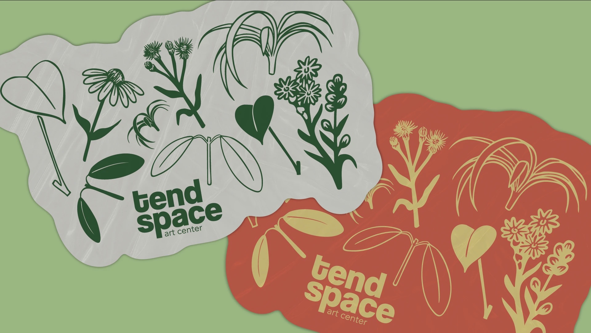 Botanical sticker & pattern system
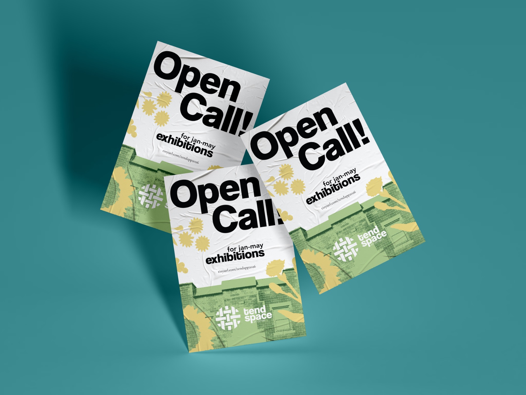 “Open Call” exhibition posters
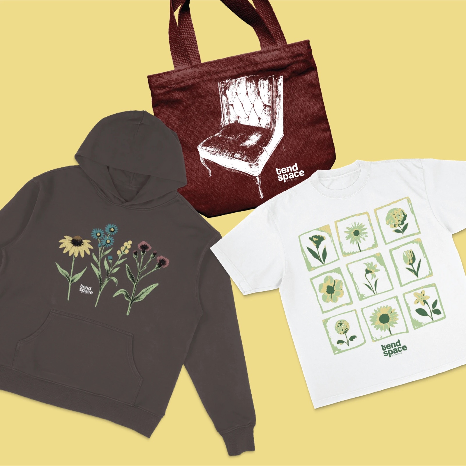 Merch — hoodie, tote & tee
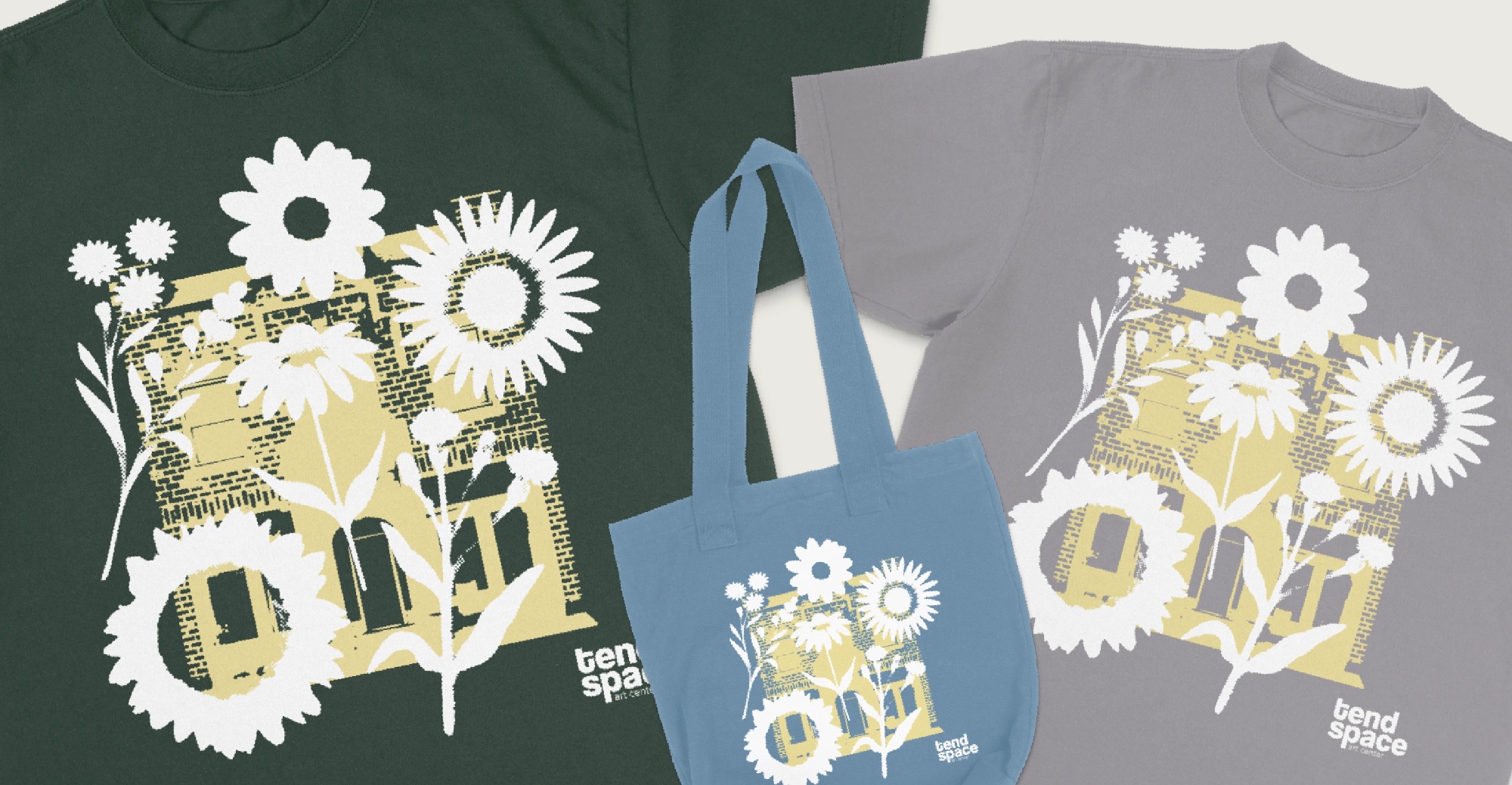 Screenprinted apparel — building & botanical series
The best identity for a community space is one that makes people feel like they belong — confident enough to lead, warm enough to welcome.