Enjoy what you love. Move forward.
A premium snack first.
A protein snack second.
For health-conscious adults who refuse to choose between craving and care, SHIFT is the premium better-for-you snack that delivers indulgent taste with real protein — because enjoyment and progress were never meant to be opposites. Warm, not soft. Confident, not loud.
Macros without the joy.
Chalky bars, clinical packaging, gym-bro energy. The premium middle of the category was simply empty.
Reformulate a favorite.
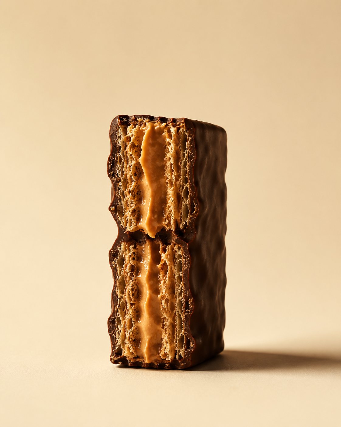
Start with a beloved snack — the chocolate-coated peanut butter wafer — and rebuild it as a real protein snack.
Snack first, protein second.
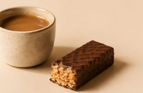
On the snack shelf, not the supplement aisle — premium, adult, and genuinely crave-worthy.
The snack you already love, rebuilt.
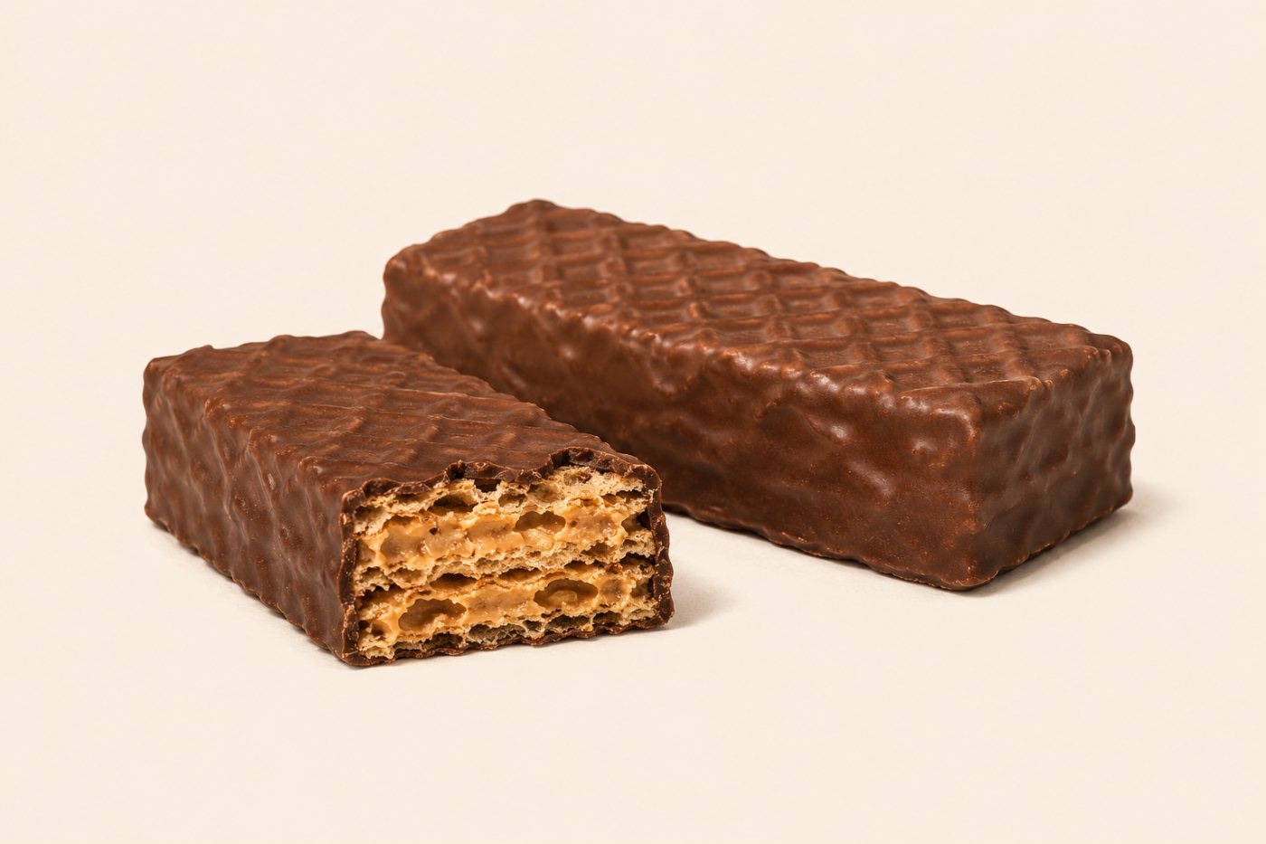 Chocolate-coated peanut butter wafer
 Reversed — cream on cocoa
Palette — warm cocoa & cream, caramel accent, a single green for nutrition.
Type — an editorial serif for warmth, a clean grotesque for clarity.
Strategy, positioning, verbal identity, and the complete visual system — documented end to end. Scroll the live book below, or open it full-screen.
↑ The complete SHIFT brand guidelines — scroll, or open full ↗Best viewed full-screen — tap above to open the book.


Enjoy what you love.
Move forward.