Pathway · Brand & Product Case Study | Made by Anthony
Brand & product case study
AI operating system · 2026

Find your path.

The brand and product identity for an AI operating system that turns everything happening across a business into one clear direction — and the next move, with confidence.
Role
Brand · Identity · Product · Web
Category
AI operating system
Year
2026
Reading time
9 minutes
Scroll
00The brief

An AI that doesn't add a dashboard. It gives a direction.

Pathway reads everything happening across an organization and answers one question most software avoids: what should we do next? The identity had to make that promise feel calm and certain — intelligent without the theatre that surrounds most AI. The whole system is built to do one thing: replace noise with a heading.

The tension I designed against
Clearnot complicated
Decisivenot noisy
Technicalnot cold
Boldnever shouting

Every decision that follows is an answer to one of these four. When a choice served two at once, it stayed.

01The symbol

Not a letter.
A route.

It reads as a continuous path that changes direction with intention and never stops moving forward. The eye follows it the way you follow a route on a map — each turn deliberate, each corner a decision. The fact that it also resolves into a "p" is a quiet bonus, never the point.

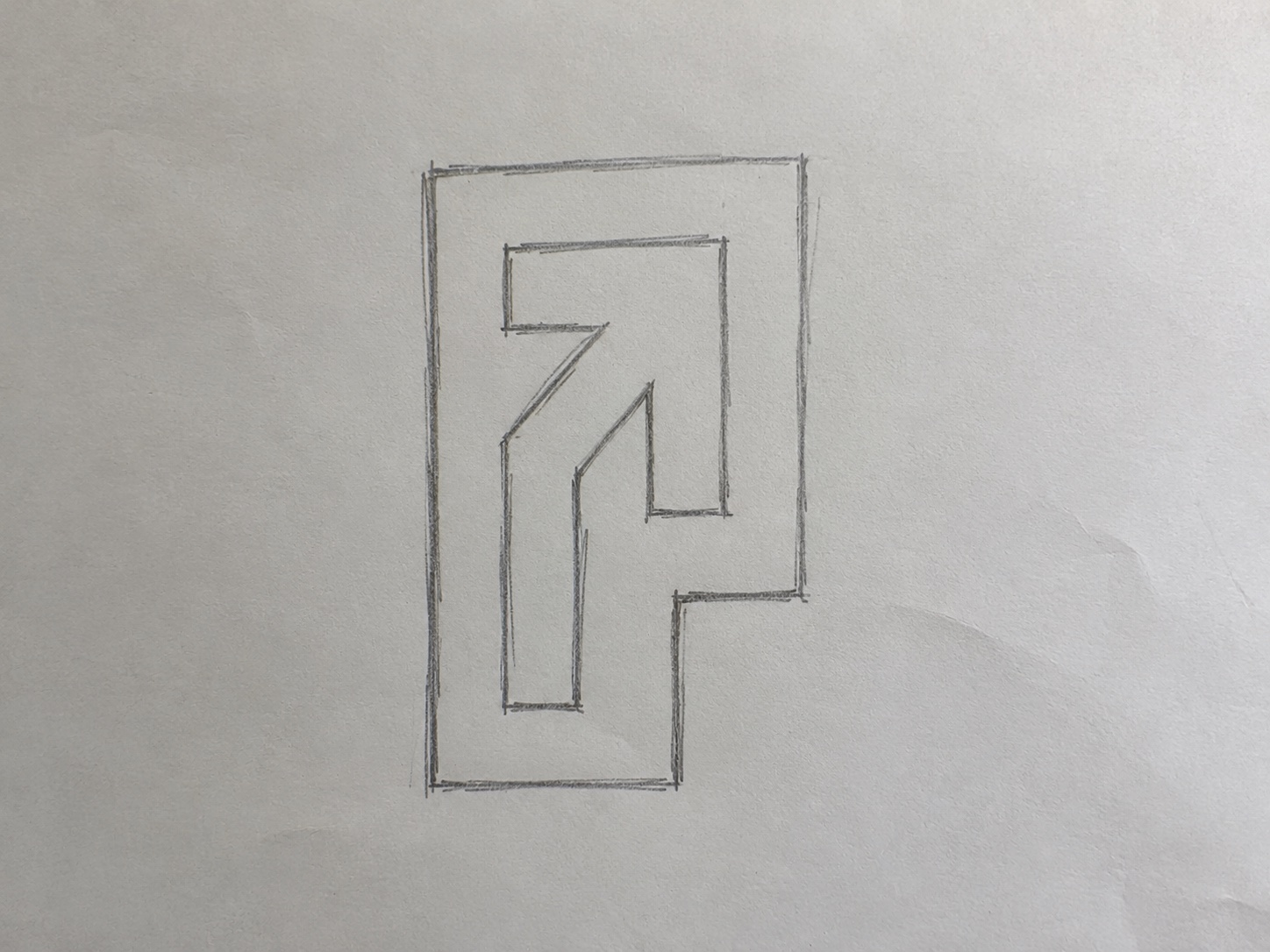
Early hand sketch of the Pathway symbol
Sketchbook · first pass
It started on paper

The mark barely moved from the first sketch. That early pass already held the whole idea — an enclosure you enter from the bottom, one turn, and an arrow breaking out toward the top-right. Everything after was discipline, not discovery: a single stroke width, true right angles, the counters cut to match. The concept was right the moment it left the pencil.

Sketch → resolved mark
Construction grid
How it's built

Right-angle turns on a single modular unit. The counters are cut to the same width as the strokes, so the path stays even at any size and the whole mark optically balances on its own center — no eyeballing.

GeometryOne stroke width. Every turn is 90°. Nothing tapers.
ReadingA path that steps upward, then turns — progress, not a glyph.
ScaleHolds from a 16px favicon to a building-side mural.
The mark holds in any context
02Wordmark & lockup

Lowercase. Even.
Quietly confident.

Why lowercase

Capitals would posture. Lowercase keeps Pathway at eye level — an assistant that talks to you, not down at you. The letterforms are set wide and even so the word reads as one steady run with no spikes in rhythm. It feels engineered, not styled.

The one rule

In any live surface the wordmark never travels alone — symbol and wordmark move together as the lockup. The symbol leads. It's the difference between a logo and a label.

Wordmark alone
Symbol + wordmark
Clear space & minimum size — protecting the mark
x Clear space = one counter-height on every side.
180 px
Lockup min
120 px
Wordmark min
24 px
Symbol min

Clarity creates
momentum.

03Color

Five colors, one aura.

Electric Lime is the only loud color in the system, which is exactly why it works. Held to roughly a tenth of any surface, against a confident black-and-paper base, it never tips into neon overload — it stays a signal you can trust to mean act here.

HERO · ~10%
Electric Lime
#C7FF2F
BASE
Primary Black
#0D0D0D
SURFACE
Off White
#F4F4F0
SUPPORT
Neutral Gray
#6B6B6B
ACCENT
Cool Teal
#2A9A9A
The 10% rule, made visible
BLACK 62
PAPER 28
10

One focal point per layout gets the lime — a CTA, a number, a single word. The moment a second thing competes for it, attention scatters and the signal stops meaning anything.

Aa
LIME / BLACK
Aa
BLACK / LIME
Aa
PAPER / BLACK
Aa
BLACK / PAPER
The signature gradient — the lime aura
Vertical bloom
Radial glow
Find your
path.
On screen

Lime → cool teal → deep black, always anchored on the dark end. Beyond the gradient, teal does one more job — a quiet secondary emphasis in type — while lime stays reserved for the single focal point.

04Typography
Geist
One typeface across display, interface and body. A precise modern grotesque — technical, never cold. Four weights carry the entire hierarchy, so nothing in the system ever needs a second family.
Aa
Light · 300
Aa
Regular · 400
Aa
Bold · 700
Aa
Black · 900
Hierarchy — how a page is built
Display
900
Know where to go next
Headline
700
Every decision shapes tomorrow
Subhead
300
Progress starts with direction — clearly, deliberately, at speed.
Body
400
Body copy sits in Regular with generous leading, measures held to 45–75 characters and set flush left. The weight jump from 300 to 900 — skipping the middle — is what gives the system its voice: calm reading, decisive statements, nothing in between to mumble.
Label
700
Find your path — est. 2026
05Graphic language & motion

Direction is the through-line.

Every graphic element is cut from the same idea as the symbol: a route that moves forward. Motion isn't decoration here — it's how the brand says this way without words. Things step up and to the right; they never drift backward.

→→→
Forward arrows
Drawn from the symbol's cut. Always point right or up.
Motion hatch
Diagonal rhythm for edges and dividers. Reads as speed.
The path line
Node to node, decision to decision — always stepping up.
Signal → route → next move · the core animation
Revenue Pipeline Churn Hiring Usage Support NEXT MOVE · 94%Shift spend toretention

This single diagram is the whole product, drawn once: many signals on the left, one mark in the middle that weighs them, one recommendation on the right. It became the spine of the website, the loading states, and the way every feature is explained.

06The interface

Thousands of signals. One recommendation.

The interface had one job: never make the user weigh the options themselves. Every screen resolves to a single recommended move, its reasoning, its projected impact, and one button to act. Confidence is shown, not claimed — so trust builds every time the call turns out right.

Recommendation card
Highest impact94% confidence
Shift onboarding spend to retention this quarter.
Churn concentrates in week two. Re-routing 18% of budget projects the largest gain in net revenue.
Impact
Take this pathWhy this?

Hierarchy does the work: a lime tag pulls the eye to why now, the headline states the move, the bar quantifies it, and one filled button is the obvious next action.

Components
Find your path Get started Learn more
Recommended Operations Hiring Growth
Ask Pathway what to do next…
Pathway suggests one move this week.
07The website · live

The whole system, in one scroll.

pathway.ai Open live ↗
Fig. 01 · Product site · fully interactive
A few interaction decisions, and why
The aura breathes

The hero gradient drifts and scales on a slow loop, then parallaxes away as you scroll. Movement signals a living system without ever demanding attention.

Magnetic CTAs

The primary buttons lean toward the cursor. A tiny, physical cue that the one action on the page wants to be taken.

Routes draw in

Path lines draw themselves on scroll and a node travels them. The eye is led exactly where the argument goes — motion reinforcing navigation.
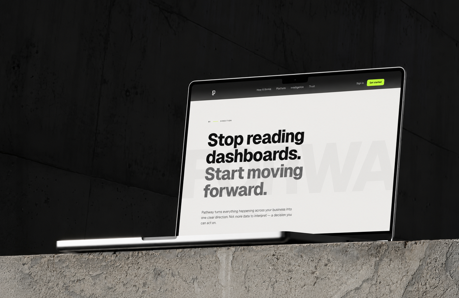
Pathway website on a laptop in a concrete environment
08Applications

The system,
in the world.

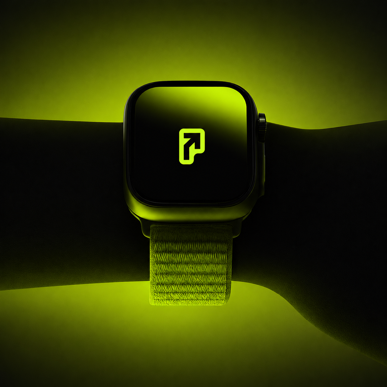
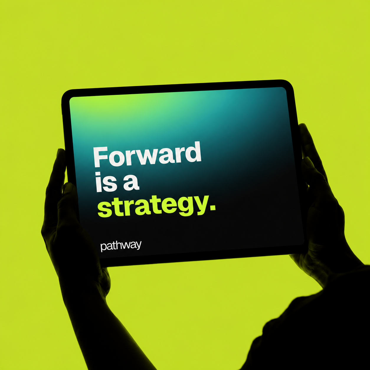
A small kit of parts — one symbol, four colors, one typeface — has to survive every surface it lands on. Here it scales from a 1024px favicon to a watch face to a building-side campaign without ever needing a new rule.
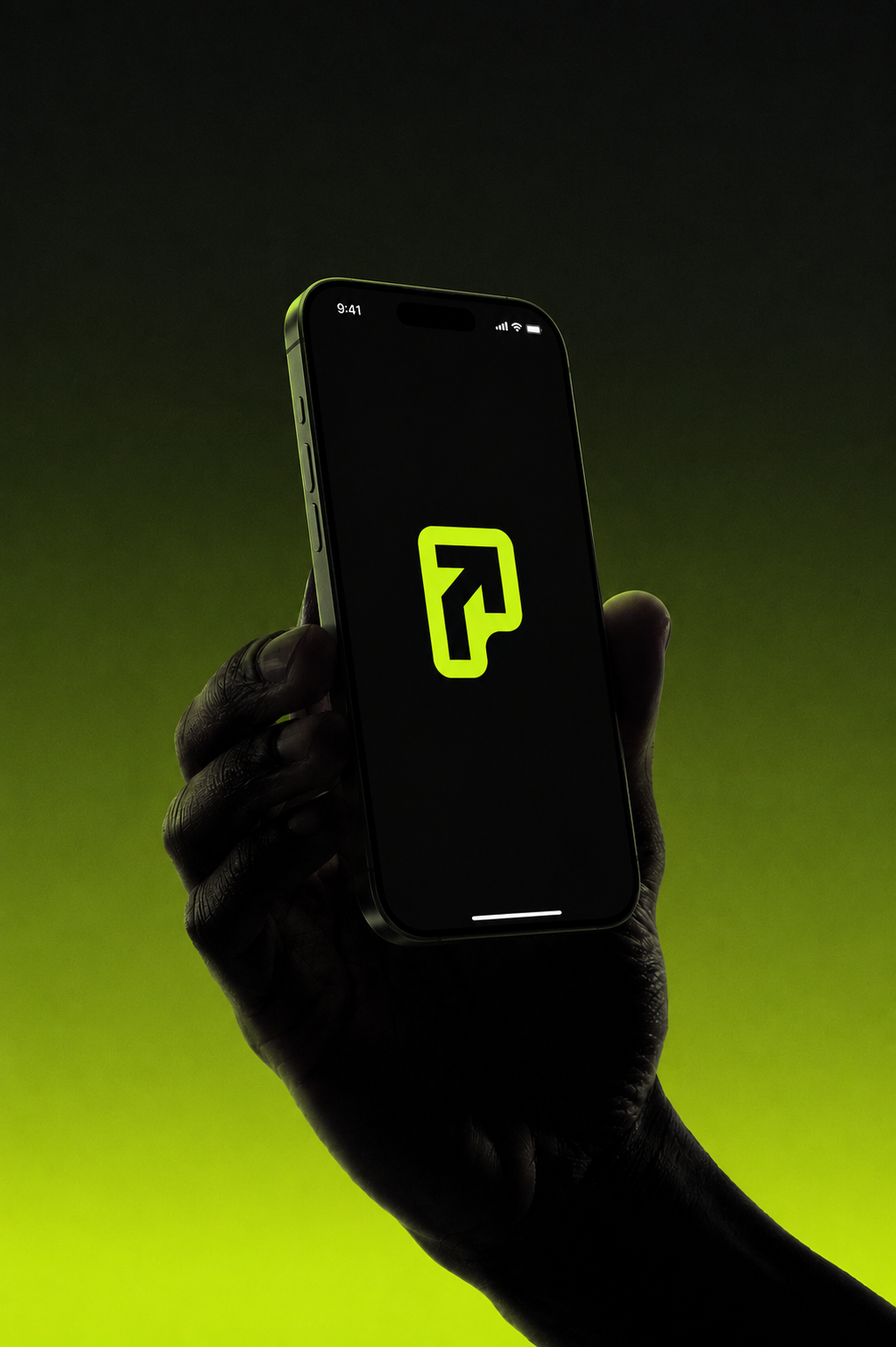
Pathway app splash on iPhoneApp splash
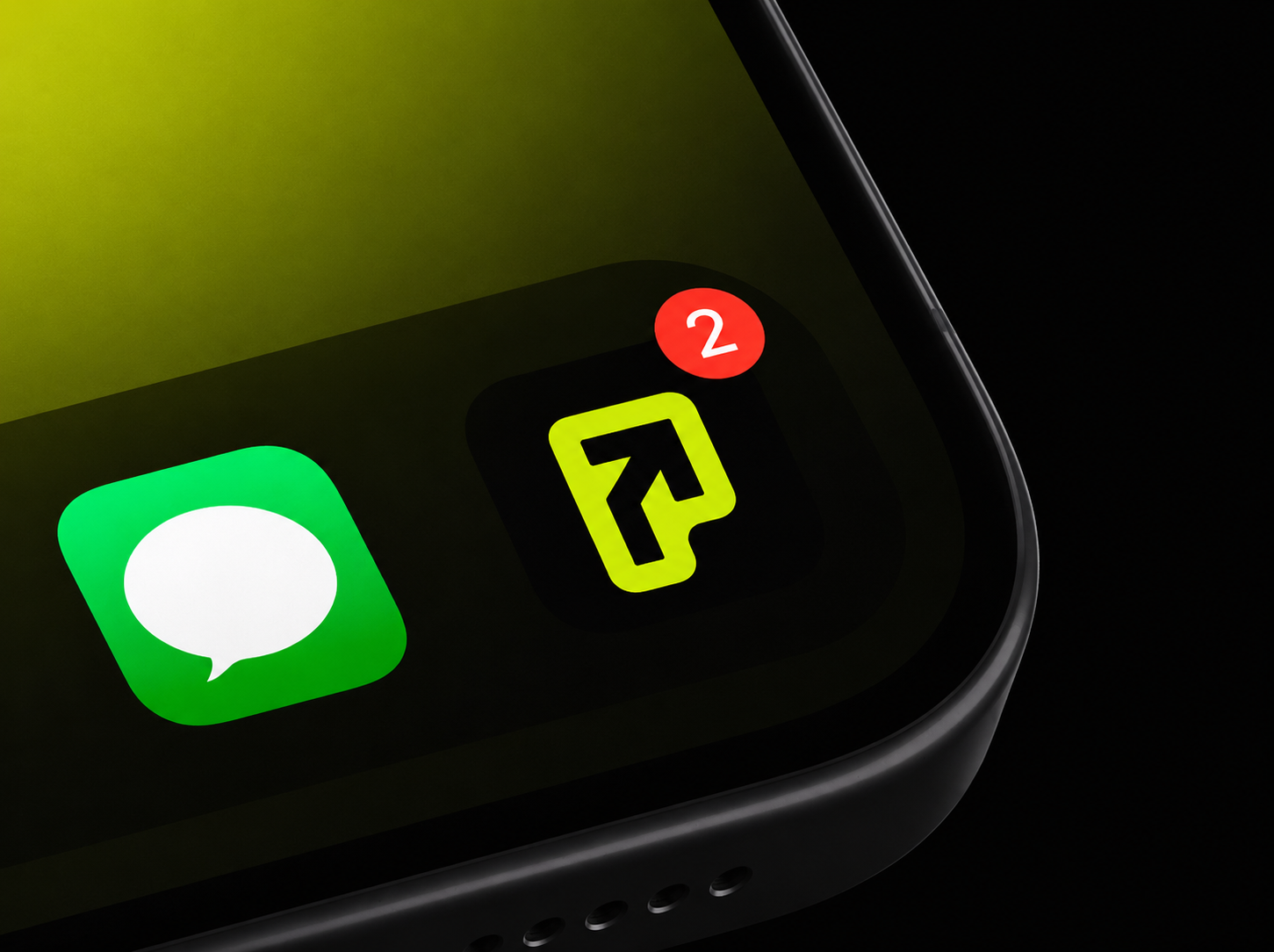
Pathway app icon on iOS home screenApp icon
Pathway symbol on Apple WatchWearable
Forward is a strategy campaign on iPadCampaign
↔ Drag to explore the touchpoints
10Reflection

Most AI brands sell intelligence. Pathway had to sell certainty.

The hard part was never the surface. It was deciding that the entire identity should resolve to a single gesture — forward — and then having the discipline to let one mark, one accent and one typeface carry it everywhere. Restraint is what reads as confidence. The fewer the moves, the more each one means.

That's the through-line of how I work: a brand isn't a logo and a palette, it's a system of decisions that all agree with each other. When the symbol, the type, the color and the motion are all saying the same thing, the product feels trustworthy before a single feature is explained. Forward is a strategy.
Anthony · brand, product & design
Next chapter
OrbitAn AI operating system for a whole life.
Next case
Have something to build?

Let's find your path.

Start a project
Start a project
ORBIT