Find your path.
Five colors, one aura.
Electric Lime is the only loud color in the system, which is exactly why it works. Held to roughly a tenth of any surface, against a confident black-and-paper base, it never tips into neon overload — it stays a signal you can trust to mean act here.
One focal point per layout gets the lime — a CTA, a number, a single word. The moment a second thing competes for it, attention scatters and the signal stops meaning anything.
Lime → cool teal → deep black, always anchored on the dark end. Beyond the gradient, teal does one more job — a quiet secondary emphasis in type — while lime stays reserved for the single focal point.
900
700
300
400
700
Thousands of signals. One recommendation.
The interface had one job: never make the user weigh the options themselves. Every screen resolves to a single recommended move, its reasoning, its projected impact, and one button to act. Confidence is shown, not claimed — so trust builds every time the call turns out right.
Hierarchy does the work: a lime tag pulls the eye to why now, the headline states the move, the bar quantifies it, and one filled button is the obvious next action.
The hero gradient drifts and scales on a slow loop, then parallaxes away as you scroll. Movement signals a living system without ever demanding attention.
The primary buttons lean toward the cursor. A tiny, physical cue that the one action on the page wants to be taken.
Path lines draw themselves on scroll and a node travels them. The eye is led exactly where the argument goes — motion reinforcing navigation.
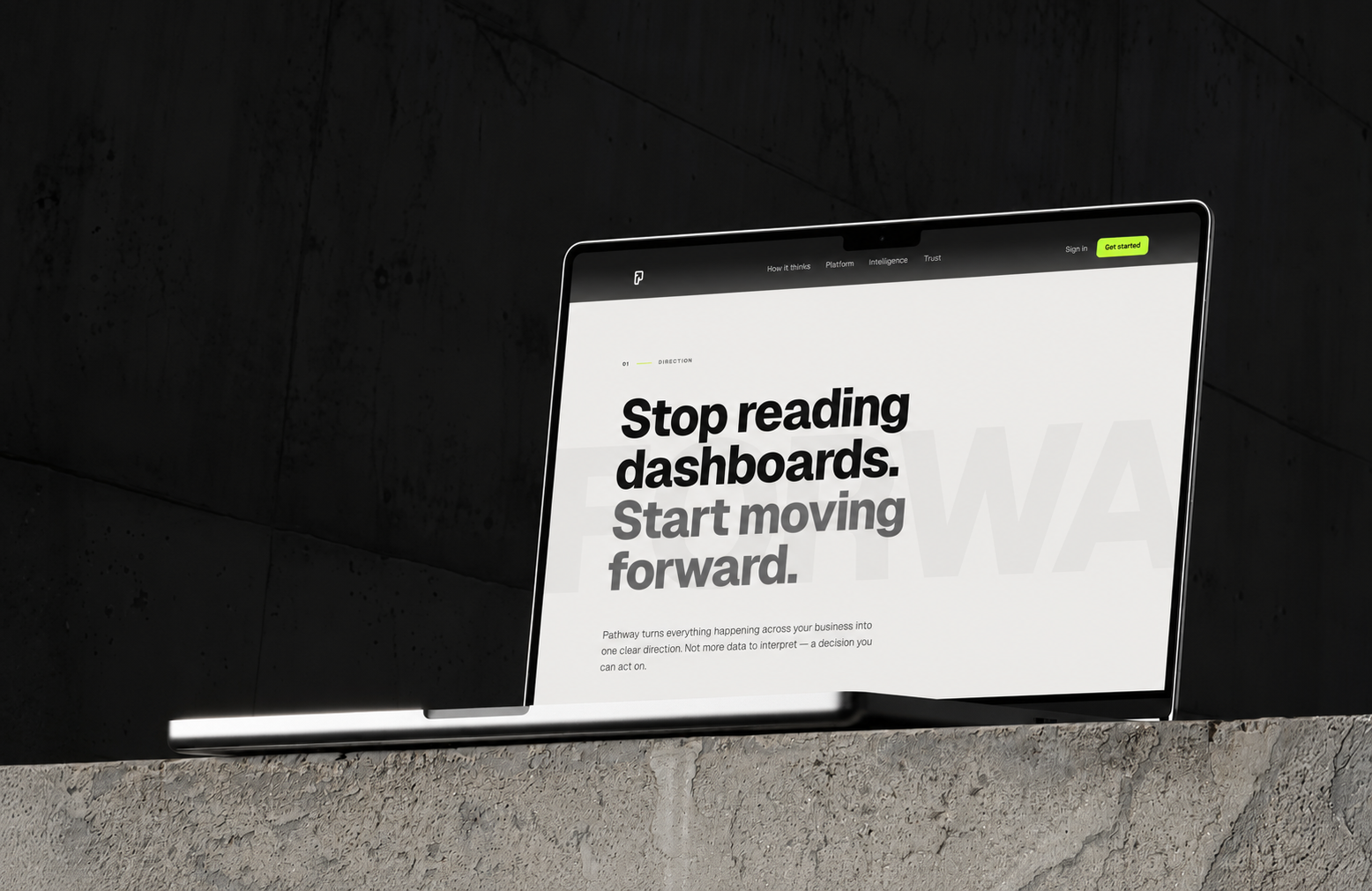
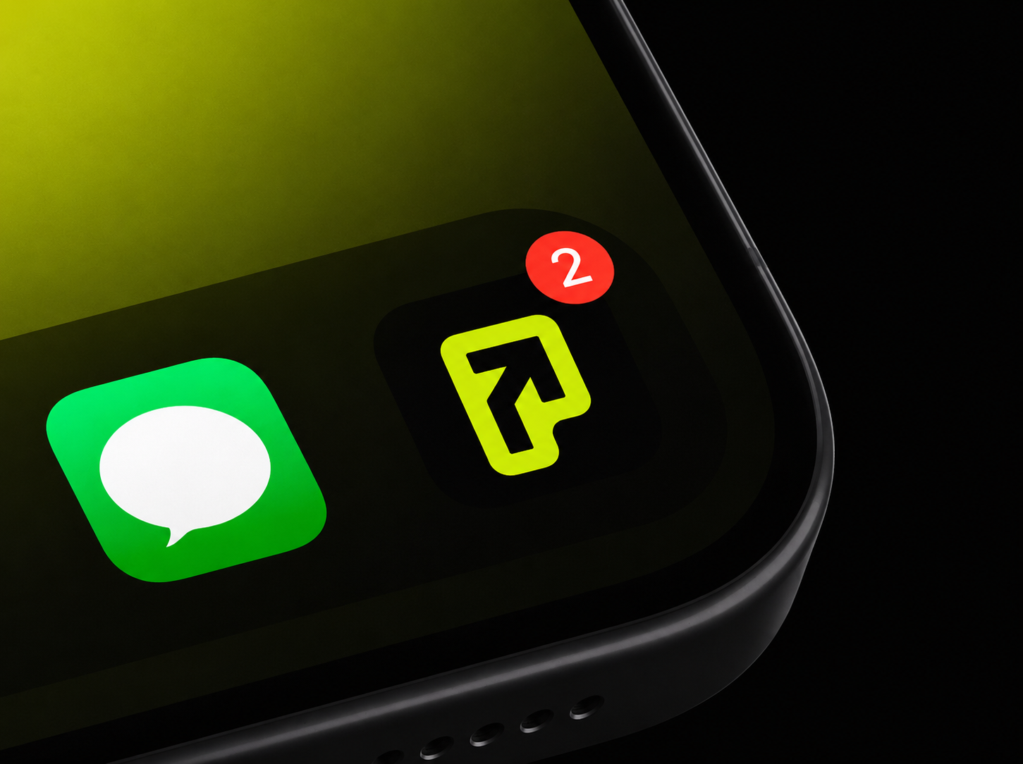
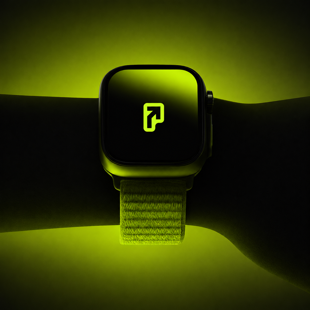
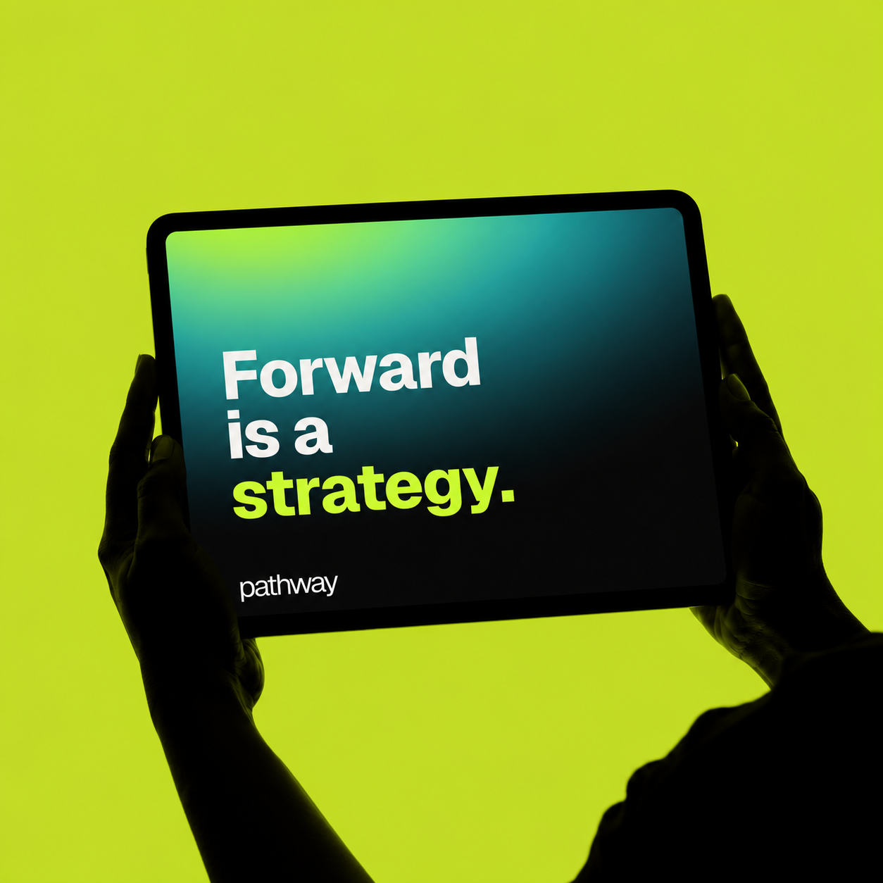
A small kit of parts — one symbol, four colors, one typeface — has to survive every surface it lands on. Here it scales from a 1024px favicon to a watch face to a building-side campaign without ever needing a new rule.
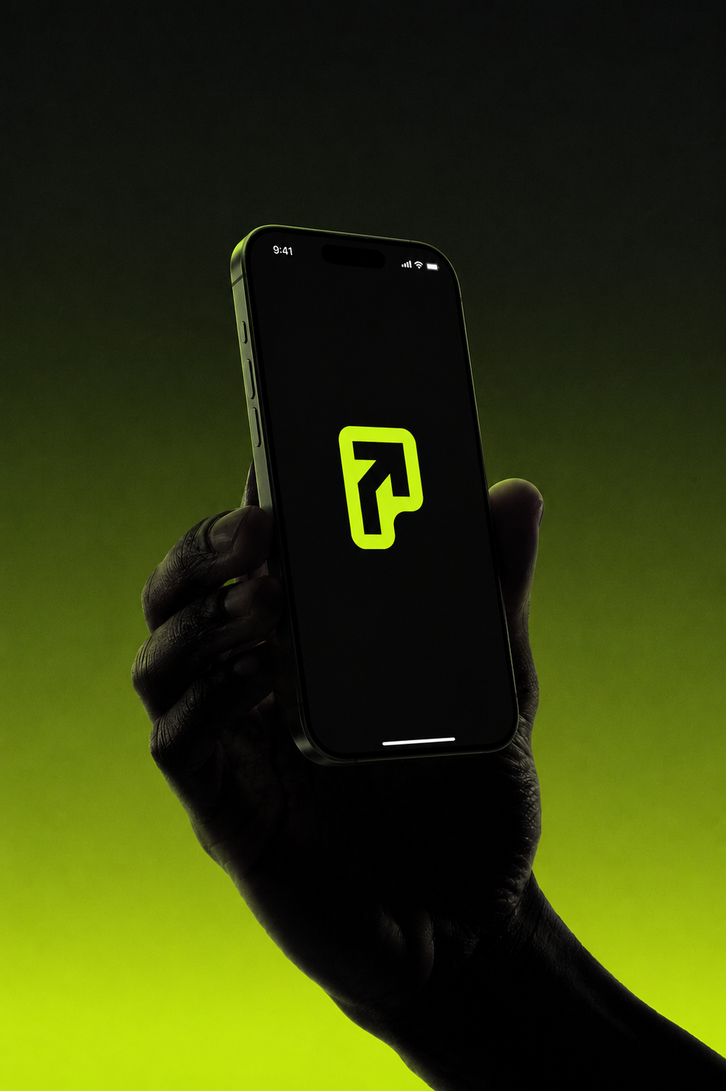
It springs in, then settles.
The symbol pops and finds its footing, the wordmark steps up letter by letter, and the accent zips across to close. Energetic, directional, and over in under two seconds — a brand that's already moving by the time you've read it.
Most AI brands sell intelligence. Pathway had to sell certainty.
The hard part was never the surface. It was deciding that the entire identity should resolve to a single gesture — forward — and then having the discipline to let one mark, one accent and one typeface carry it everywhere. Restraint is what reads as confidence. The fewer the moves, the more each one means.
That's the through-line of how I work: a brand isn't a logo and a palette, it's a system of decisions that all agree with each other. When the symbol, the type, the color and the motion are all saying the same thing, the product feels trustworthy before a single feature is explained. Forward is a strategy.
 Anthony · brand, product & design