Case 01 · Brand strategy, identity & website

Hauer Designs

A design-led property house. I built the whole brand end to end: strategy, identity and website, so it reads as a design studio that happens to work in property, not a landlord.

Industry
Property · Restoration
Scope
Strategy · Identity · Web
My role
Sole designer, end to end
Scroll
02What it is

A property house that thinks like a design studio.

HauerDesigns acquires overlooked residential spaces and restores them with the care of a studio, then manages them to the same standard it built them to.

The philosophy is simple and unfashionable in its industry: a home is not a unit, a lease, or a repair ticket. It is somewhere a person comes home to. Design isn't decoration here. It's the difference between a place you tolerate and one you genuinely want to live in.

Restoration Design Stewardship
03The opportunity

Property feels transactional. This shouldn't.

Most property brands look like spreadsheets: landlord logos, stock interiors, the visual language of a leasing office. They signal management, not care. The category had trained people to expect the bare minimum.

The gap was perception. HauerDesigns does design-grade work, but read as ordinary property management. My job was to close that distance: make the brand look as considered as the restorations themselves, so it stands beside Aesop and Kinfolk, not a real-estate flyer.

04Brand strategy

Most managers maintain. HauerDesigns improves.

Before I drew anything, I set the positioning: one idea, carried through every decision I made, so the identity had something true to express.

Mission

Make better places to live, and prove design belongs in property.

Positioning

A design-led property house: restoration and stewardship held to studio standards.

Audience

Residents who notice quality, and owners who want their property treated as more than an asset.

Personality

Grounded, exact, quietly confident. Warm materials, no theatrics.

Voice

Plain and declarative. "Good design is not luxury. It is attention."

Brand pillars
01
Care

Notice what others stop seeing, and fix it.

02
Craft

Every joint and sightline resolved with intent.

03
Improvement

Measured against what a place could be.

04
Reliability

Do what was said, on the day it was said.

05
Stewardship

Leave it better than you found it.

05Identity system

A mark built likea structure.

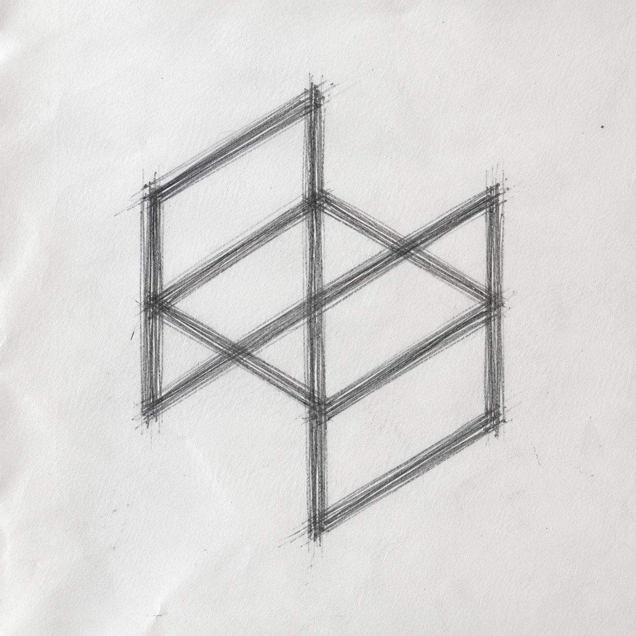
Mark construction sketch Fig. 00 · The sketch
How I drew it

I drew the symbol as an isometric cube, an open frame you can see through. It had to read as architecture and as a home in section: built, considered, never decorative.

ConstructionDrawn on a 30° isometric grid; every line is a true axis, nothing freehand.
WordmarkSet tight in Helvetica: one word, no gap, quietly architectural.
ScaleHolds from a 16px favicon to a building flag, the frame never fills in.
HauerDesigns Primary lockup
HauerDesigns reversed Reversed
Symbol
Typography
Display · Helvetica700 · −0.04em
Worth living in
Body · Helvetica400

Calm, legible, unhurried: the register the brand uses to explain itself without raising its voice.

Detail · Space Mono400 · 0.2em
EST. 2026 · CINCINNATI, OHIO
Color palette · six tones
Base · ink01 / 06
Charcoal
#2B2A2843 · 42 · 40
Primary02 / 06
Forest
#2F5D5047 · 93 · 80
Secondary03
Slate
#6E8A92 · 110·138·146
Warm neutral04
Sand
#E4DAC8 · 228·218·200
Accent05
Mint
#CFE7D6 · 207·231·214
Surface06
Bone
#F6F4F0 · 246·244·240
Logo usage
Clearspace
X X X X

Hold clear space of X on every side. X is one third of the mark's height. Keep type, edges and imagery out of it.

Minimum size
48 px
24 px
16 px · min

The open frame holds down to 16 px, the favicon floor. Smaller than that, drop the wordmark and use the symbol alone.

Never do this
Don't stretch
Don't rotate
Don't recolour
Don't add effects
06 The website

A site thatmoves like a film.

Full-bleed photography, a custom cursor, a drag-to-reveal restoration, and an interactive 3D mark. Built to be felt, not skimmed.

hauerdesigns.com
Explore the live website ↗ Fig. 06 / Homepage · fully interactive
07The system, applied

One mark,everywhere it counts.

I didn't stop at a logo. I built a system of one mark, one geometry, one level of restraint that I could hold to on everything from a business card to a building.

Card · front
HauerDesigns
Jeff Hauer
Founder · Steward
hauerdesigns.com
Cincinnati, OH
Card · back
Signage · cast plate
HauerDesigns
Est. 2026 · Cincinnati, Ohio
HauerDesigns Hauer Designs LLC
Cincinnati, OH

"Good design is not luxury. It is attention."

Letterhead
Holds to the favicon
App icon
With compliments HauerDesigns
08In the real world

Take it fora spin.

Drag the mark

09The outcome

It no longer readsas property management.

Perception

Reads as a design brand first, credible beside studios, not landlords.

Clarity

One idea: improvement over maintenance, legible in every touchpoint.

Trust

The brand now signals the same care the restorations are built with.
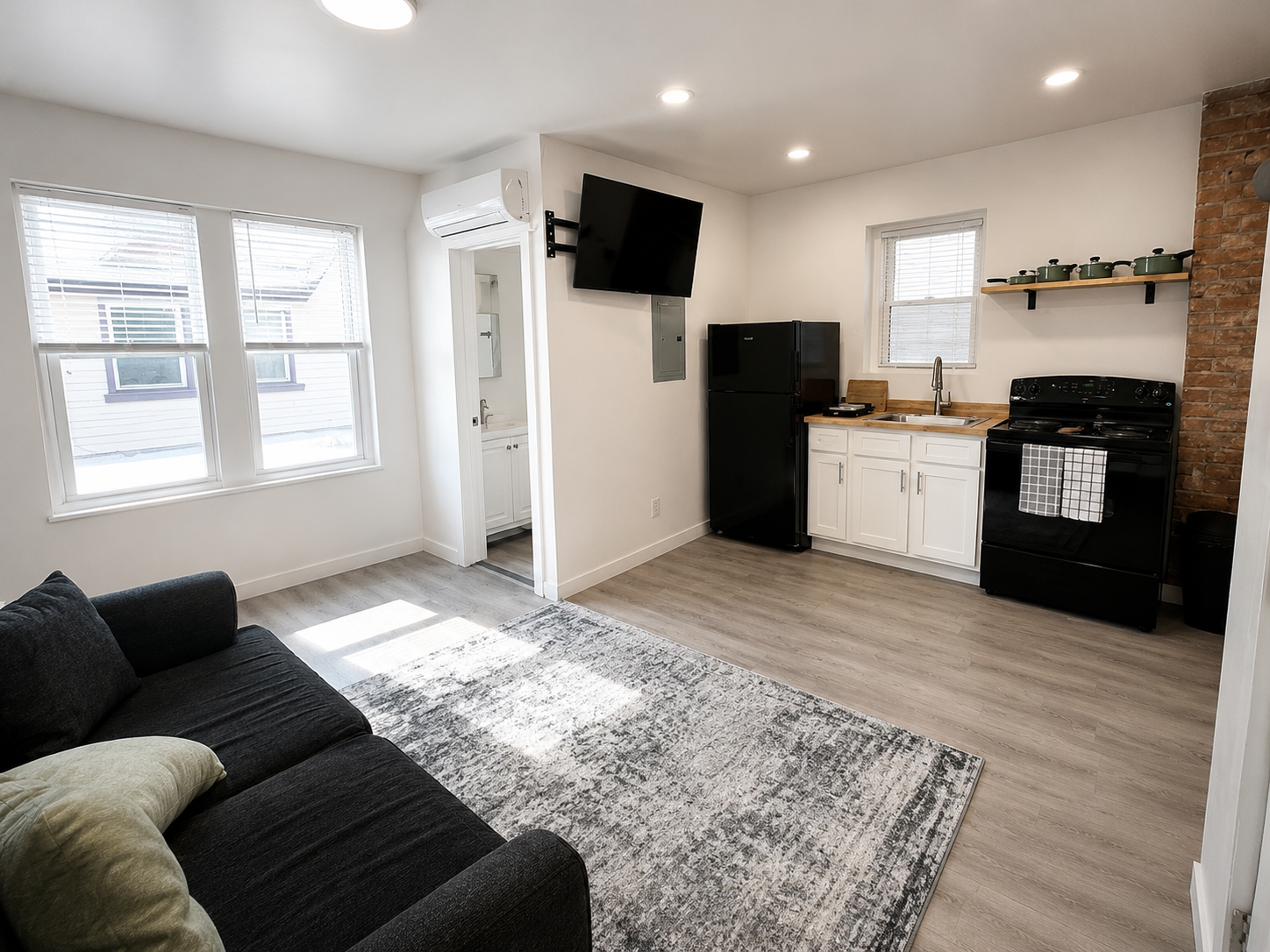
A finished HauerDesigns home

Worth living in.

Designing better places to live, a brand built to mean it. That's the standard I bring to every project.

Next project
Orbit
View ↗
Have something to build?

Let's make yourslook investable.

Start a project ↗
Start a project ↗
Orbit